When visualizing multidimensional datasets, we often want to connect individual charts together, so that one chart’s filter will apply to all the other charts. We can do it manually, filter data on the server side, and update the rendered charts. Or we can filter data on the client side, and let charts update themselves. With Crossfilter and dc.js, this work becomes simple and intuitive.
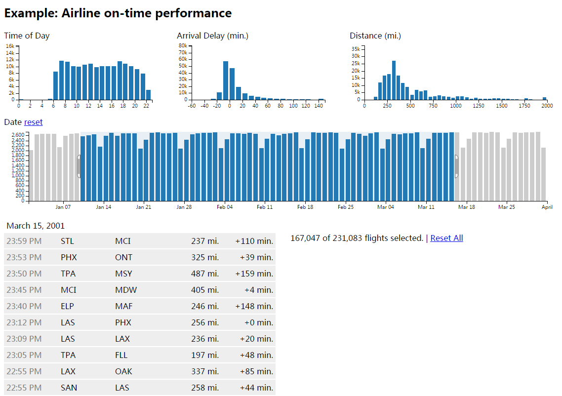
Airline On-time Performance
Here’s an example taken from Crossfilter’s official website. It’s a flight delay analysis report based on ASA Data Expo dataset. And this post will introduce how to use dc.js to build the report. A runnable JSFiddle can be found here, though the dataset is reduced to 1,000 records.
Background
Crossfilter is a JavaScript library to do multidimensional queries on large amount of data in the client’s browser. It can cross-filter between different group-by queries, so that query results will be connected and updated automatically. With the help of dc.js, also a JavaScript library that provides charting capability, together we can develop high-performance, interactive reports.
Dataset, Dimension, and Measure
There’re several concepts in Crossfilter, namely dataset, dimension, measure. If you come from a data warehouse or analytics background, these are similar to the terms in OLAP Cube.
- Dataset, or a list of records, is a two dimensional table that contains rows and columns.
- Dimension columns are used to do group-bys. They are either categorical, like dates, gender, or represents a range of values, like age range, etc.
- Measure columns are used to do aggregations, such as sum, standard deviation, so they are mostly numeric. Examples are income, number of children.
1 | let flights = d3.csv.parse(flightsCsv) |
Here we create a crossfilter object from a parsed csv data. And we define a dimension that is derived from date column, hour of day represented by float values. Then we group by its integer part. To query the top 3 hours that contains most delays:
1 | hours.top(3) |
Visualization
Now we can plot the hour of delays in a bar chart:
1 | let hourChart = dc.barChart('#hour-chart') |
The corresponding HTML code:
1 | <div id="hour-chart"> |
We can see that dc.js is highly integrated with crossfilter. We simply pass the dimension objects and do some setup for chart axes. In this example, x axis is hours of the day, and y axis is the count of delayed flights.
Note class="reset" is used with controlUseVisibility, that provides a reset button. Try to drag on the chart to filter a range of data, and you’ll see how this button is used.
Cross Filtering
We can create other charts, such as a hitogram of arrival delay in minutes. You can find the source code in JSFiddle. When you do some filtering (drag and select), the other charts will be updated simultaneously. It is great when you want to explore the distribution of data combined with filtering conditions. Just declare the relationship, and dc.js will do the rest for you.
There’re many other components like pie chart, table grid, or even customized HTML. But to master these tools, you also need some knowledge of d3.js.